Understanding FEMA and other flood maps
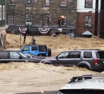
On June 29 the First Street Foundation, a nonprofit research firm, released an analysis of flood risk which shows that nearly 6 million of the nation’s properties are at more substantial risk of flooding than indicated by the Federal Emergency Management Agency’s (FEMA) maps.
FEMA replied with a statement that its maps are intended for floodplain management and decisions about emergency responses and that its flood insurance risk maps do not conflict with First Street’s maps since the two complement one another by showing different types of risk.
To help explain how flood maps work, Dr. Michel Léonard, Vice President & Senior Economist, Triple-I, wrote the following post.
Flood maps are used to identify and communicate a property’s exposure to flood.
Flood maps rank exposure from lowest to highest by categorizing an area into a set of standardized flood zones, with each zone assigned its own flood exposure level. Flood exposure is normally expressed as a percentage representing flood frequency and/or severity over a specific number of years. This approach is similar to maps for other natural perils.
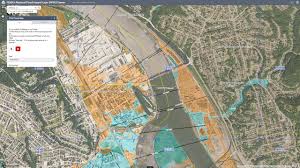
The most commonly used flood map is FEMA’s nationwide flood map. There are also several high-quality flood maps from academia, non-profits and businesses, each providing added perspectives. These maps aren’t meant to be better than one another but rather, together, to provide a fuller understanding of the risks caused by floods to homeowners, businesses, and communities.
First Street’s flood map is an example of such maps: scientific, credible, and insightful in its contribution to the discussion about current and changing flood exposure. Its main insight, that flood risk and exposure may be higher than currently implied by FEMA’s or other maps, is not a controversial statement but rather adds to the growing consensus across flood experts that flood risk is increasing in frequency and severity nationwide as a result of extreme weather events. FEMA recommends reviewing its own flood map every year due to exposure changing over time.
The main takeaway from flood maps for consumers and businesses is learning about their own relative exposure vis-à-vis other locations. Homeowners and businesses should use flood maps to better understand their current exposure and determine, for example, whether their property insurance is adequate or considering preemptive risk mitigation.
Homeowners and businesses thinking about moving should look at these maps before deciding about where to go. Will they be more or less exposed to flood? How will the new location’s flood exposure impact their mortgage, their insurance costs?
That said, while all flood maps provide insight into flood exposure, FEMA’s flood map remains different from others. As a government provided flood map, it is a countrywide benchmark for flood risk identification and quantification. It is used by different levels of government, regulators, first responders and insurance companies. For example, homeowners and businesses should know that a property’s location within a specific FEMA flood map zone is the sole benchmark for mortgage lenders requiring flood insurance in order to get a mortgage.
For more about FEMA’s flood map see: www.floodsmart.gov/flood-map-zone/about